
Revelstoke reveals a new visual identity: REVELSTOKE.
The branding drew heavily on Revelstoke’s past and the industries that built it
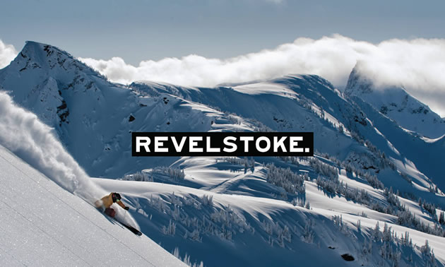
The new branding reflects Revelstoke’s status as an original Canadian adventure vacation destination, full of quintessential B.C. mountain town experiences. — Photo courtesy See Revelstoke
The new Tourism Revelstoke brand identity reflecting Revelstoke’s history as an adventure destination was unveiled recently at the Explorers Society Hotel.
The new look was designed by C&B Advertising of Calgary, under the guidance of the Revelstoke Tourism Advisory Committee. It reflects Revelstoke’s status as an original Canadian adventure vacation destination, full of quintessential B.C. mountain town experiences.
The branding process began with what Revelstoke Tourism stood for and how we wanted to present our community. We wanted to ensure our new brand recognized the themes that helped shape Revelstoke into the vibrant mountain town it is today.
To do this, we drew heavily on Revelstoke’s past and the industries that built it, as well as looked ahead to our future as a world class destination.
The new logo takes inspiration from the original hand-painted sign of the historic railway station. It is a nod to the past while embodying everything the future of Revelstoke stands for: bold, original, and unique. The typeface is full of character, with even offset strokes showing our individuality. The strong punctuation reaffirms our position in the outdoor adventure landscape. We’re one of the best in the world. Period.
The importance of reflecting our environment is echoed in the colour scheme. The black and white logo represents a sense of certainty in our identity and a clean, modern take on tourism branding, The deep forest green is pulled straight from the forests that surround our town. The burgundy and gold are an acknowledgement of our industries and a recognition of the hard-working nature of our community. The accent colours are all found in our community and were an important part of blending the new brand with the real spirit of Revelstoke.
Central to the new identity is authenticity. Revelstoke is a destination like no other and our new brand reflects this. It captures the raw beauty of our landscape, the industrial backbone of our community, and our status as a dream adventure hub. We aren’t just a working town or just a resort town. We are sitting at the feet of giant mountains and nestled into spectacular rainforests, whilst being on the main Trans-Canada route. We’re neither too remote nor too accessible. We’re for finding your peace in nature and your greatest thrills.
Revelstoke has it all and we firmly believe there is nowhere that comes close. We’re thrilled to share a new image that encapsulates this.
For the complete Brand Story visit: www.seerevelstoke.com/brand-launch/


Comments