
Kimberley, B.C.: This is not your grandfather’s branding
How can a brand stay modern without leaving behind the nostalgic feelings for past branding success?
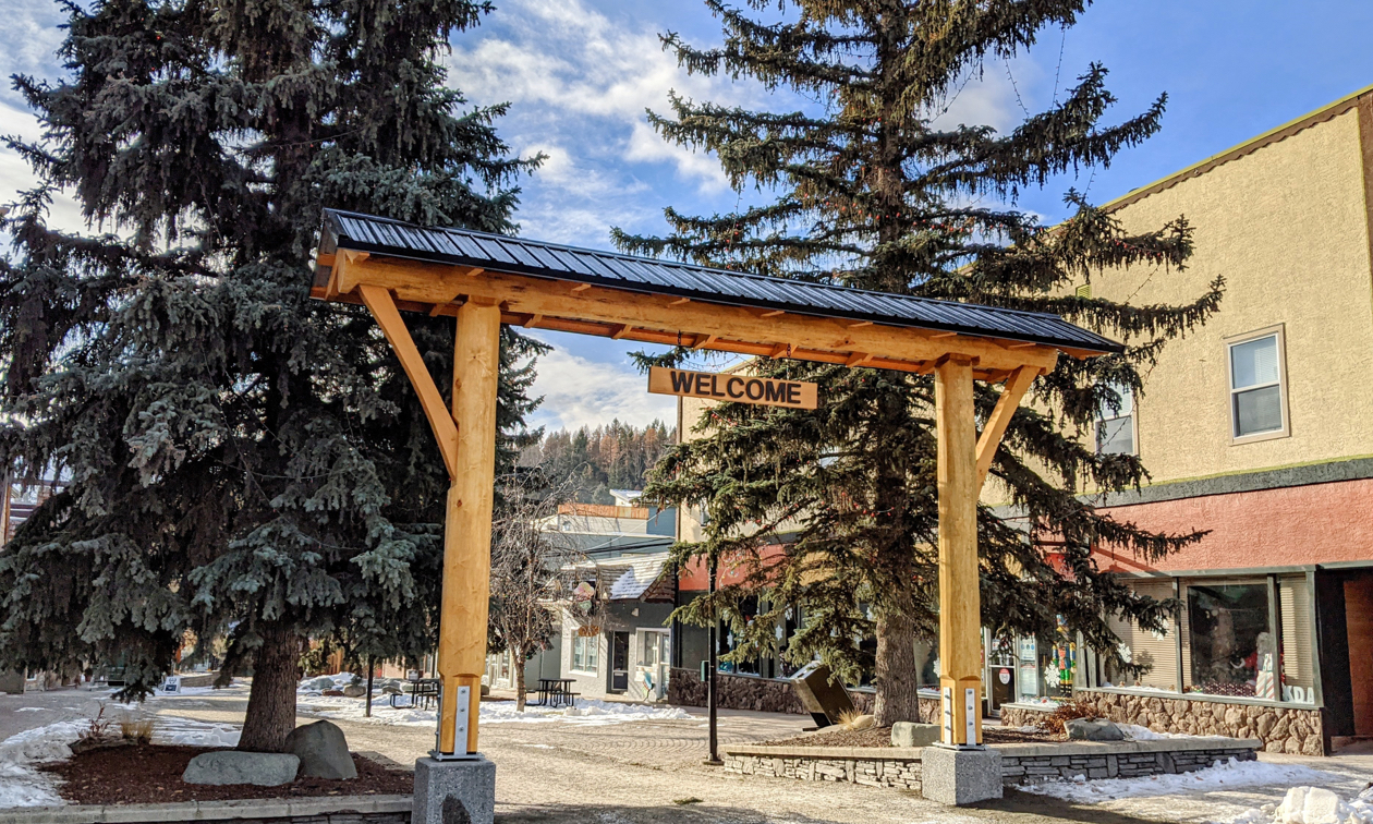
Kimberley ditches the kitsch with simple, bright messages that bring the oomph without the oom-pah-pah. — Photo courtesy City of Kimberley
My grandfather had three loves: family, friends and his accordion.
Every spring, like clockwork, my grandfather would dust off his “Scandinavian squeezebox” and start preparing for the only event that he deemed worth attending—Kimberley’s International Old Time Accordion Championship. That championship was the main event at Kimberley’s JulyFest for 39 years and in its heyday was one of the most celebrated accordion festivals in the world.
All good things come to an end and the final oom-pah-pah hurrah happened in 2012 during Kimberley’s last Accordion Championship. With the loss of the accordions, Kimberley also lost a little oomph from its Bavarian-themed branding.
Kimberley had the foresight in the early 1970s—while its main employer, the Sulivan mine, was still in full production—to begin transforming the community from a resource town to a tourist town. Thus in 1973 Kimberley became “The Bavarian City of the Rockies” and its beloved mascot Happy Hans was born. More than a branding buzzword, the city embraced the Bavarian theme by transforming downtown Kimberly into a pedestrian-only shopping area called the Platzl and painted every fire hydrant for miles with Bavarian personalities.
The challenge that all mature brands must face
Some 40 years after Kimberley’s kitschy Bavarian brand was born, a new challenge came to the fore. It’s a challenge that popular and mature brands of all stripes can learn from. The challenge is this: how can a brand stay modern without leaving behind the nostalgic feelings for past branding success?
For Kimberley, the challenge was how to transition away from the no-longer hipster Hans to a more grown-up and sophisticated brand.
The Kimberley brand grows up
Although Kimberley was ahead of the curve in branding their city as a tourism destination, they failed to have a logo. That was resolved with a simple K above an all caps KIMBERLEY and the tagline “A good place to be” (view the logo and brand on kimberley.ca).
Why was that approach taken? KootenayBiz.com reached out to Pam Walsh, the manager of Community Development and Communications with the City of Kimberley, to explain.
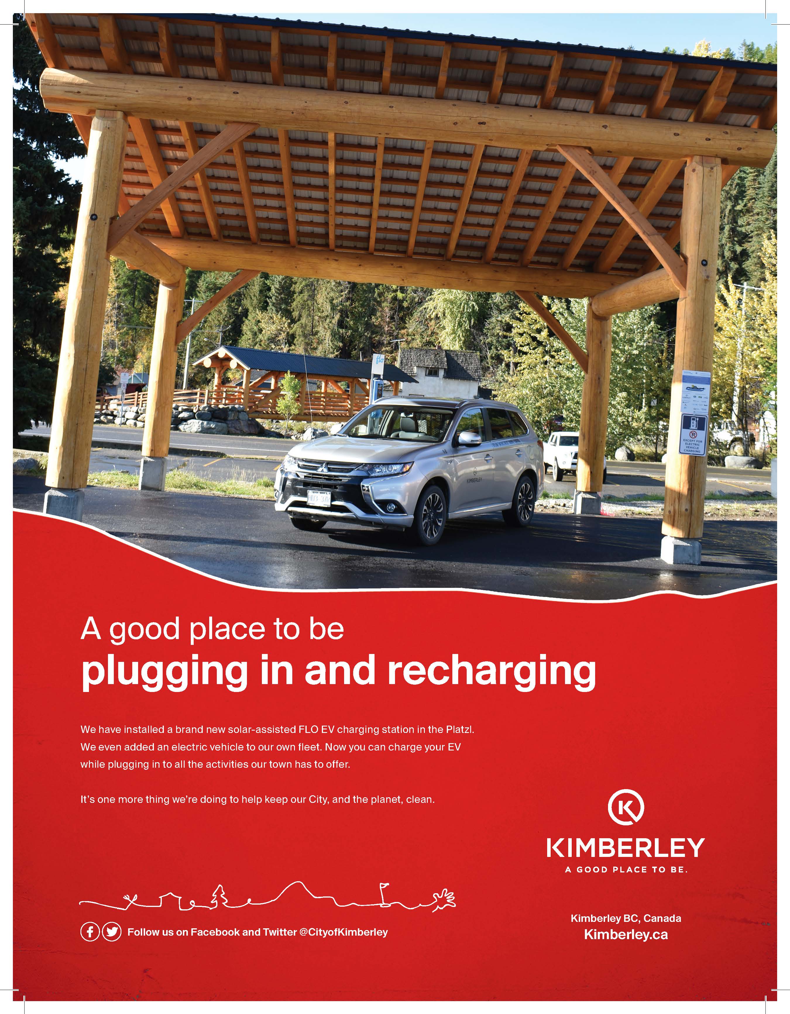
— Image courtesy City of Kimberley
When did the City of Kimberley adopt the tagline “A good place to be”? Which company created it?
The funny thing about the tagline “A good place to be” is that it was never meant to be “A good place to be (period).” It was always intended to be “A good place to be (doing something, seeing something, creating something!).” A good place to be … telling our story (for example). You’ll never see one of our ads without the call to do something or see something! Yes, it is a good place to be but it’s a better place to be doing something awesome!
The tagline was developed by marketing and branding firm Story & Co. They are a Kimberley-based firm that supports branding efforts for amazing companies such as Kicking Horse Coffee and many other destinations. We are so lucky to have them in Kimberley!
Why do you think this tagline suits your community?
We like to move it move it! (like the song!)
We are a good place to be but we are a better place to be doin’ somethin’! Kimberley isn’t a sleepy town in the mountains—we are riding, rolling, skiing, sliding, walking, yoga’ing (is that a word?), shopping, swimming, festivaling (also not a word), eating, hiking, kayaking (close by) and all the other ways people get moving and having fun. We are a good place to be doing all of those things and more. We can be a little sleepy town in the evenings but who can blame us after all that daytime activity!
How has your tagline been received by tourists, residents and businesses? Do you think it has helped to build community identity or pride?
Most people love it! There is something in the tagline that everyone can relate too. Whether it’s a good place to be “an extreme sports enthusiast” or a good place to be “sitting in the sun,” there’s something in there for everyone and that’s what makes it so special. It’s definitely increased community pride and really has been adopted by local businesses and organizations.
There’s a new cake shop in town called GROW and I just noticed that they are using the hashtag #a good place to eat, which is awesome, and a few local restaurants use a good place to be eating. I’ve seen dozens of variations of it and #agoodplacetobe is a very popular hashtag on Instagram! There’s no doubt that the tagline has done its job and is absolutely indicative of all that Kimberley has to offer.
How has the tagline been used? Do the businesses in your community play off of this tagline theme?
Kimberley’s branding was developed in conjunction with the Kimberley and District Chamber of Commerce and Tourism Kimberley. Working together definitely increased the amount of people seeing and remembering the brand and increased people’s interest in coming to check out our little town!
— Image courtesy City of Kimberley
How does this tagline fit into your community branding?
I think the best thing about our tagline and brand is its longevity and that helps distinguish us from others. All organizations try to come up with the best brand, tagline, etc. and hope that it carries for years to come. We’ve hit that sweet spot with our brand in that it is recognizable and memorable. We’ve had some flack on the logo itself in that it resembles a certain convenience store brand but we don’t let that sway us! We aren’t straying from our brand anytime soon.
Have you been involved in a “Buy Local” campaign in any way? Please describe.
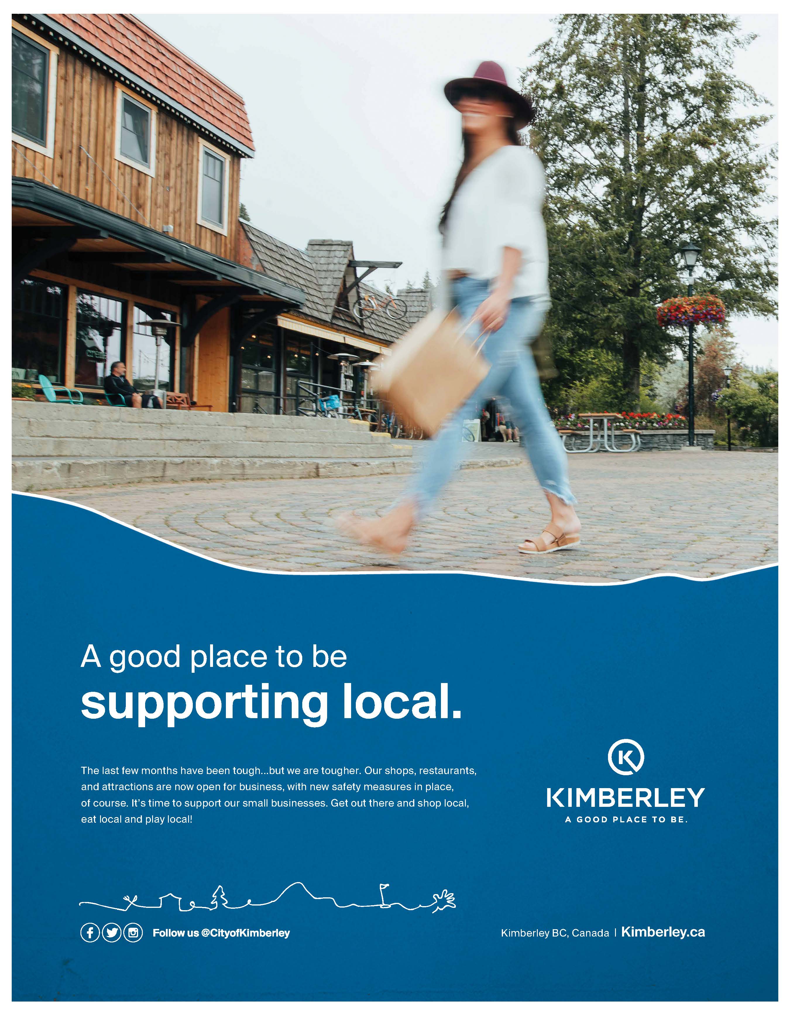
We have certainly supported Buy Local through the Covid-19 pandemic. All of our recent magazine ads have been aimed at locals to encourage them to stay local and shop local. These ads were a little more literal than we like to be but we recognized the importance of clear messaging through the pandemic. One ad’s tagline was simply “A good place to be supporting local.” Straight and to the point. We had local photographer Chelsea Boyd Gibson of Meadowsweet Photography take an image for us of a lone woman shopping in the Platzl (our pedestrian-only mall). The description was a call to action for our residents to stay local, shop local, eat local and play local. At the beginning of the pandemic we were so worried about our entrepreneurs but we are hearing that many are surviving based on the support from folks right here in Kimberley.
We also walk the talk. The disruption of the regular staff Christmas party was a blessing in that we decided to give every City employee a $50 gift certificate to be used at any of the local businesses participating in the Chamber of Commerce Countdown to Christmas Program. It was a small way to support our local entrepreneurs.
What advice do you have for other municipalities considering branding work?
- Don’t take yourself too seriously!
- Too many cooks spoil the pot!
- Stick with it!


Comments