
New visual identity for Village of Canal Flats
The logo work is an interpretation of mountain peaks in the top portion of the icon but in a more stylistic and distinctive way
New logo for Canal Flats. — Photo courtesy Village of Canal Flats
Council has adopted a new visual identity for the Village of Canal Flats. It’s an important step in moving toward a vision established in the Economic Development Strategy: We are the affordable, family-friendly village building a new future in housing, quality of place, tourism, and a unique work-live downtown. We will be a key employment centre in a Columbia Valley that reconnects people to nature....and each other.
Creating jobs, tourism development, and enhancing community amenities that have recreational property owners (50% of property ownership in the Village) spending more or full-time in the Village in future are core elements of the Economic Development Strategy. So is affordable housing innovation that will help attract families, creative folks and independent entrepreneurs who work in Canal Flats or the Valley. A full-time population of 1000 people within 10 years is our target.
This direction is important to all current residents. Jobs creative new opportunities. We can keep the school open. More tax revenue helps all taxpayers more affordably pay for everything from pipes under the ground to the arena. Re-building the Village Centre is important to the community’s soul. More people drives demand for new commercial services that avoid having people drive elsewhere to get them.
So why start with a logo?
- We need to change the conversation in the market – from a mill closure community to a progressive, forward looking community that is stepping boldly into the future. This requires a dynamic image. Clean, simple, and colourful is important. First impression is important.
- Consumer research indicates that positive image is directly correlated with consumer purchasing behaviour. Research also indicates that consumers have a positive or negative impression of key marketing tools like websites within 1/10th of a second.
- We are selling a vision to investors, entrepreneurs, visitors, etc. who have to imagine things that aren’t there yet. Seeking pioneers and homesteaders requires image and salesmanship that is positioned for the future.
A number of new visual identity options were presented at a September, 2017 Community Forum (approx. 35 residents) that focused on presentation of the Economic Development Strategy. A straw poll of residents indicated that, of the options, there was strong preference for the option that has now been adopted. This option was further improved/refined and presented to Council by the Economic Development Officer on two occasions in the Fall of 2017. Based on further comments, modest further adjustments were made to the visual identity.
The logo work is an interpretation of mountain peaks in the top portion of the icon – but in a more stylistic and distinctive way (in the genre of modern logo work like Nike) compared to other mountain communities. The bottom portion of the icon reflects water waves in abstract form, signifying the Columbia Lake and Kootenay River. In total, some interpret the icon as a bird – conveying nature and the free spirit of the surrounding mountain rise. Some interpret the icon as a fishing fly – which connects to the Kootenay River as a key distinguishing geographic feature of the community. Bright colouring conveys dynamism. Blue and green colouring of the word mark reflects association with water (blue), and coniferous trees (green).
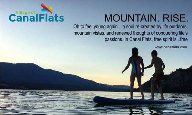
When we combine the logo with implementation in marketing like an Investment Guide, Investment Opportunity sheets (both can be found in the Business section of the existing Village website), advertising, and other work to come like a new Village website, the overall impact of positive image will start to be seen more clearly.
The cover of the 2018 Columbia Valley Map Book. — Photo courtesy Village of Canal Flats
There is no consensus in anything. Art forms like logo work have less consensus because “art” generates opinions. Nothing will be perfect. Nothing is ever cast in stone. Therefore key things to ask with this and any initiative moving forward are:
- Is it helping with achieving the strategy – which has benefits for everyone?
- Is it better than the existing? This new visual identity is a good step forward in both respects.
Change is uncomfortable. It introduces unknowns. But the Village has to adapt to change if it is to achieve things important to all of us, like generating new jobs, keeping the school open, and maintaining affordable taxes.
A next milestone is coming shortly with a series of policy adjustments to better encourage housing innovation. A new Village website is currently under redevelopment. A new Official Community Plan and Land Use Bylaw will also help the Village step into the future.


Comments